京都
Kyoto
Using Twitter To Understand Place
An investigation of applying big-data to capture social activity in Kyoto
Japan has one of the highest Twitter engagement levels in the world, with it being shown to have more engagement than Facebook. The features of compact messages and geo-location along with heavy usage in Japan make it an exciting tool for exploration of objectively how people discuss a place. Kyoto is one of the oldest and most visited city in Japan with many temples, shrines as well as universities and industries. It's relatively small size but diverse activities makes it an interesting place to explore what is captured by big-data and how we can use this to understand a place better.
Base Data
The data area chosen captures the main area around Kyoto whilst still being separate from Osaka, Otsu and the Biwako Lake area. It does however cover the smaller Yamashina Ward to the east.
The data used in this study comes from over 13 million Tweets over a 3 year period; mid 2012 to mid 2015.
All of these tweets are the public geo-located tweets from Twitter, so represent a group of messages from a self-selecting but large range of individuals.
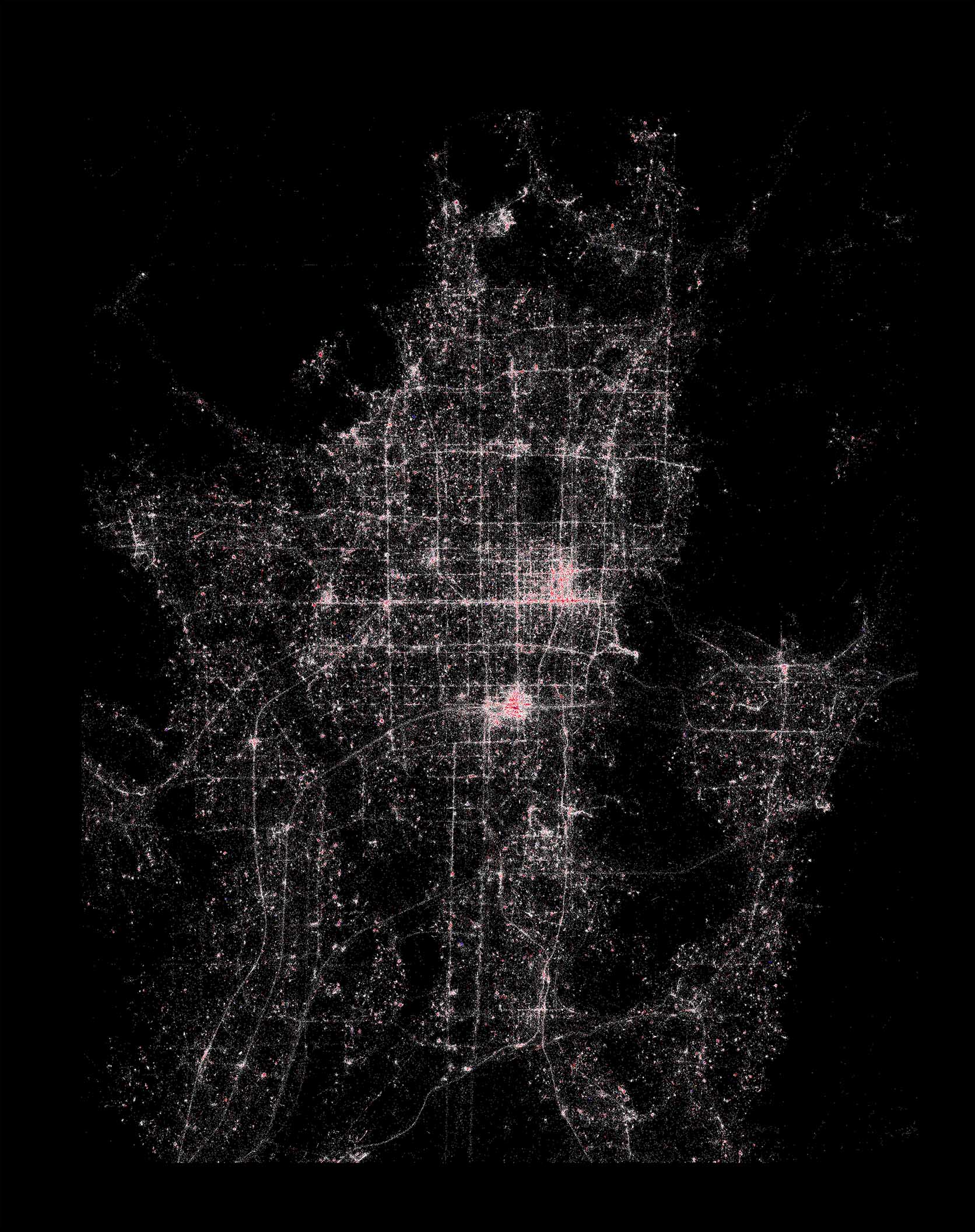
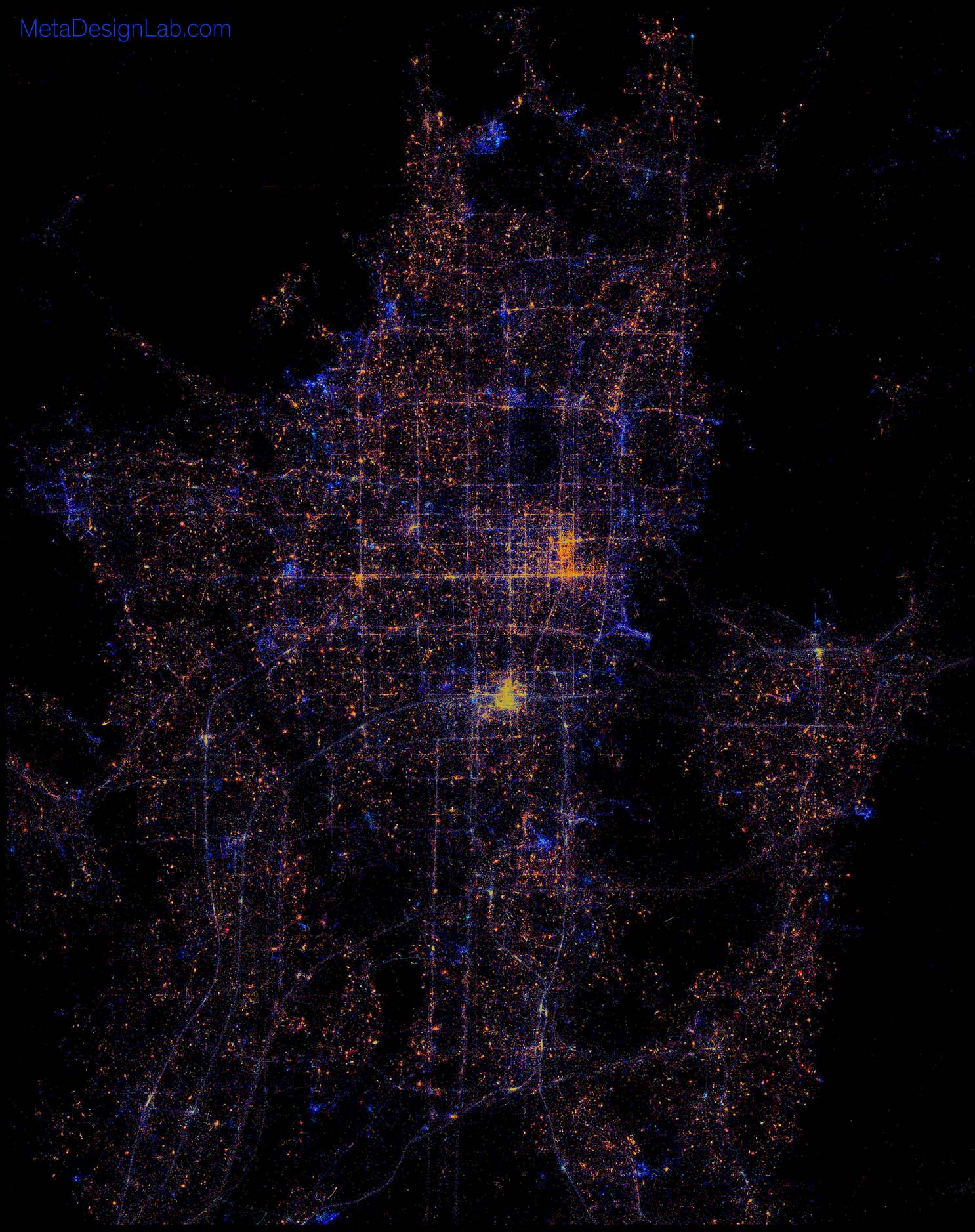
AS shown in the below image the twitter points shown as a mass of dots cover a large area of Kyoto and are more dense in highly trafficked areas such as Kyoto Station, major roads such as Sjijo Dori and Sanjo Dori as well as Temple areas like Matsubara Dori.
This data not only has a location but of course the short message of up to 140 Characters, as well as 'meta-data' such as the user who sent it the time it was sent.
This all provides in testing ways as looking who, where, what and when people discuss the city.
Temporal Analysis
The data comes from the geo-tagged database of collaborating researcher Ate Poorthuis. The exact bounds are [135.665874, 135.846119] longitude and [34.906346,35.089153] latitude. This returns exactly 13,658,049 unique points, tweets that are sent in Kyoto but are not public or do not have a geo-location can not be included. Twitter which was made available from 2006 only became popular after 2010 in Japan it increased in user base over time. This can be shown in the data with the number of tweets increasing over the period measured.
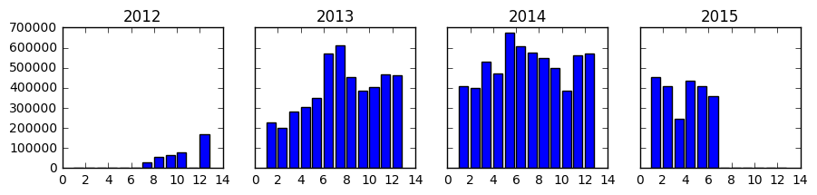
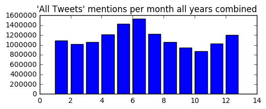
Aggregating all the months together we can see a trend that the summer months of May and June are the most popular with an additional rise in December. However it is unclear if this is a product of the changes in popularity in Twitter or actually an annual trend.
If we look at the days sent there is a trend towards a slightly more messages being sent during weekends, imply more messages sent at non working times.

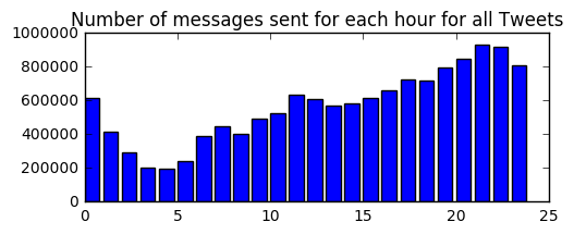
If we look at the time off day that the message is sent we can see that the number of Tweets sent in Kyoto is lowest at 4 and 5am and maximum at 10pm. This again reinforces the hypothesis that most messaging is undertaken during break and time off work.
Spatial Temporal Analysis
We may also look at placing this activity on a map. If we split the Tweets into 4 sections: 'morning' 5-9am, 'day' 9am-6pm','evening 6-10pm, and 'night' 10pm-5am. Each tweet is coloured Cyan, Blue, Yellow and Red for each respective time slot.
Each time slot is chosen to highlight different activity periods over the day, namely;
- Cyan : 5.00-9.00 : Morning : Waking up and Commuting
- Blue : 9.00-18.00 : Day : Working and Lunch
- Yellow : 18:00-22:00 : Evening : Dinner and Entertainment
- Red : 22:00-5:00 : Night : Late Entertainment Bed Time
Although the data is overlapping in the center of the plot we can clearly see a large amount of activity at Kyoto station. Above and to the right we see the main east to west (right to left) shopping streets of Shijo Dori and above that Sanjo Dori, and between them the covered pedestrian street of Teramachi. Interestingly the much wider trafficked east to west street Oike Dori has less activity and then mostly during the day. This shopping area is a warmer colour as compared to the train station indicating more evening and night activity as compared with the more balanced and morning heavy station.
Elsewhere we can see that there are distinct blue areas indicating those which are used primarily in the day, the are situated mostly on the city boarder and in the main indicate areas of shrines and tourist attractions. We may also notice that whilst in the centre most activity operates along the main rectilinear grid, in more residential areas such as to the north west and the nearly separate ward of Yamashina we see a different texture of clustered activities. This typically relates to social areas such as coffee shops bars and restaurants showing that in these paces there are more distinct small local centers as proposed to the draw of the main city.
Was well as the road network being visible the train system is also obvious the curved routes show that much Twitter activity happened on trains and at stations. However the metro-network and areas where trains pass under tunnels are not captured.
User Analysis
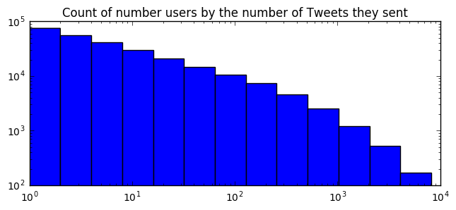
We can also consider the individual users who make up the population of opinions in Kyoto. The Twitter data shows who set the message by a unique user name, this allows us to look at how the individuals relate to the mass of messages. What we see is that there are 264,580 unique users contributing the 13 million Tweets. This equates to just under 52 messages per person, however the actual activity is not that simple. Over 70% of all users send 10 or less messages, with 75 thousand users only Tweeting one time. This is shown as a histogram for users of 10 or less messages.

This relationship between users and messages can be seen to extend to the other end where there are some 63 users who tweeted over 10,000 times each. Some nearly 100,000 times, the Y-scale must be made logarithmic in order to still show the small number of users who message more than 10 times. This is shown below:

This data however shows quite a consistent trend which is typical in social networks if the number of messages and users are both shown on a logarithmic scale. Here we can see that there is a relatively liner inverse correlation between number of users and the number of tweets they send.
However looking at many of these users we can see that they are automated bots which say the same message or copy existing messages. One oddity is that many of these messages have their location set at Fushimi Inari Shrine, a famous Shino Shrne with many 'Tori' or gates. This seems to be a defult location for tweet messages in Kyoto and actually 8,432,780 messages actually originate from the very specific 34.967096 : 135.772691 (lat:long) coordinates. This cannot be a coincidence but shows how over half of the data is not useful to understanding real users. Whilst the overall number rapidly drops there is little change to the above tweets except if we look at the yearly distribution:

Here we can see that above with all tweets and below with these points removed. This has a similar shape however during the 2013 in the mid summer there is a pronounced peak. It is possible that this links to the 'Gion Matsuri' festival which starts there during that period; but this very unlikely, due to it being in an overly specific location which is not consistent with real GPS data.
User Movement
We can look at sequential messages by users which are sufficiently close together to understand flows between different places. This can be done by looking at messages which are sent in quick secession by the same user. Showing how they travel around a place.
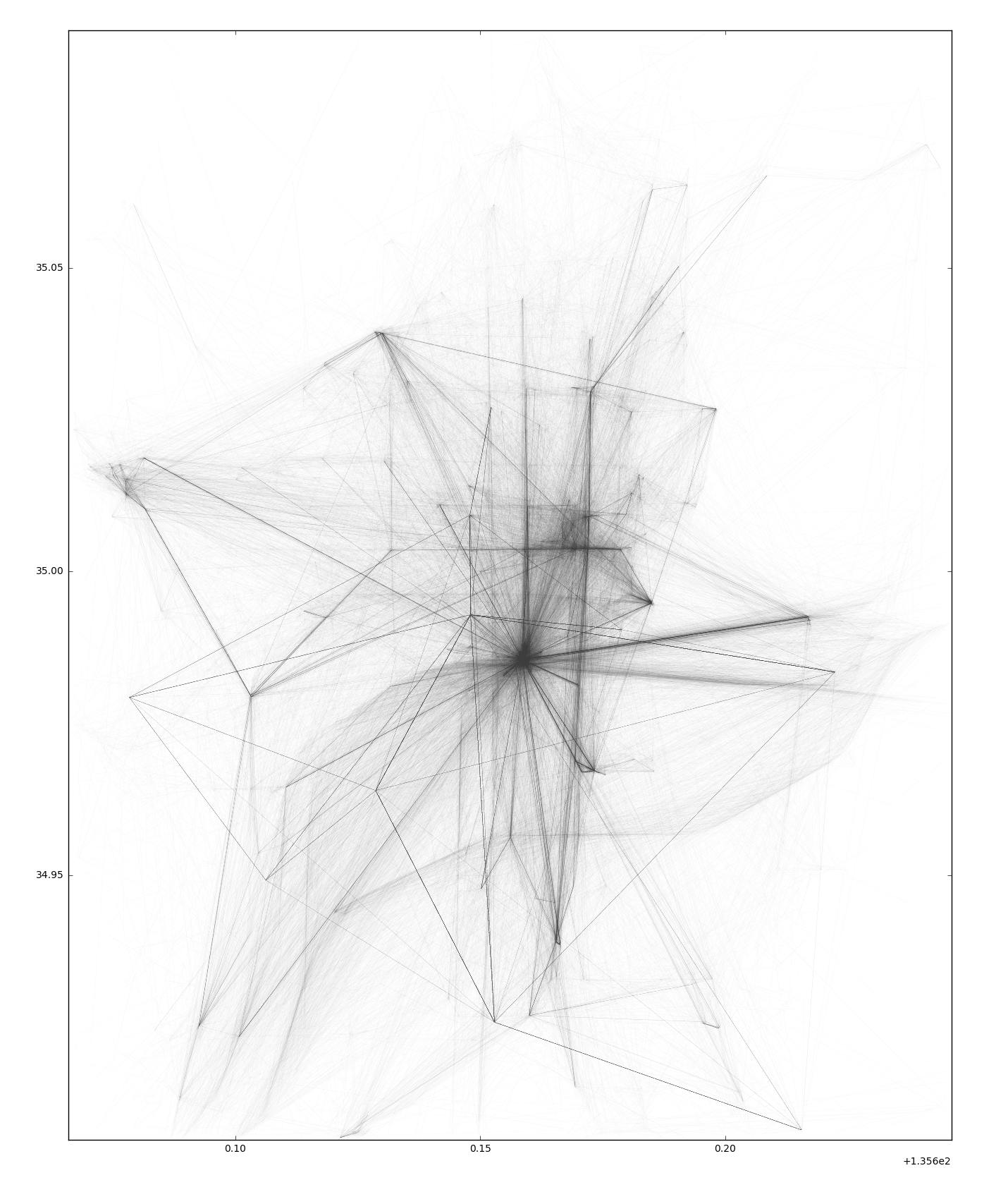

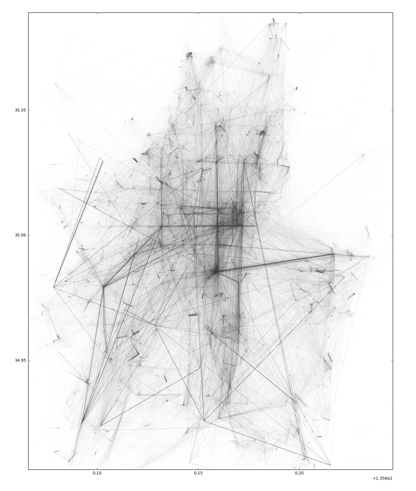
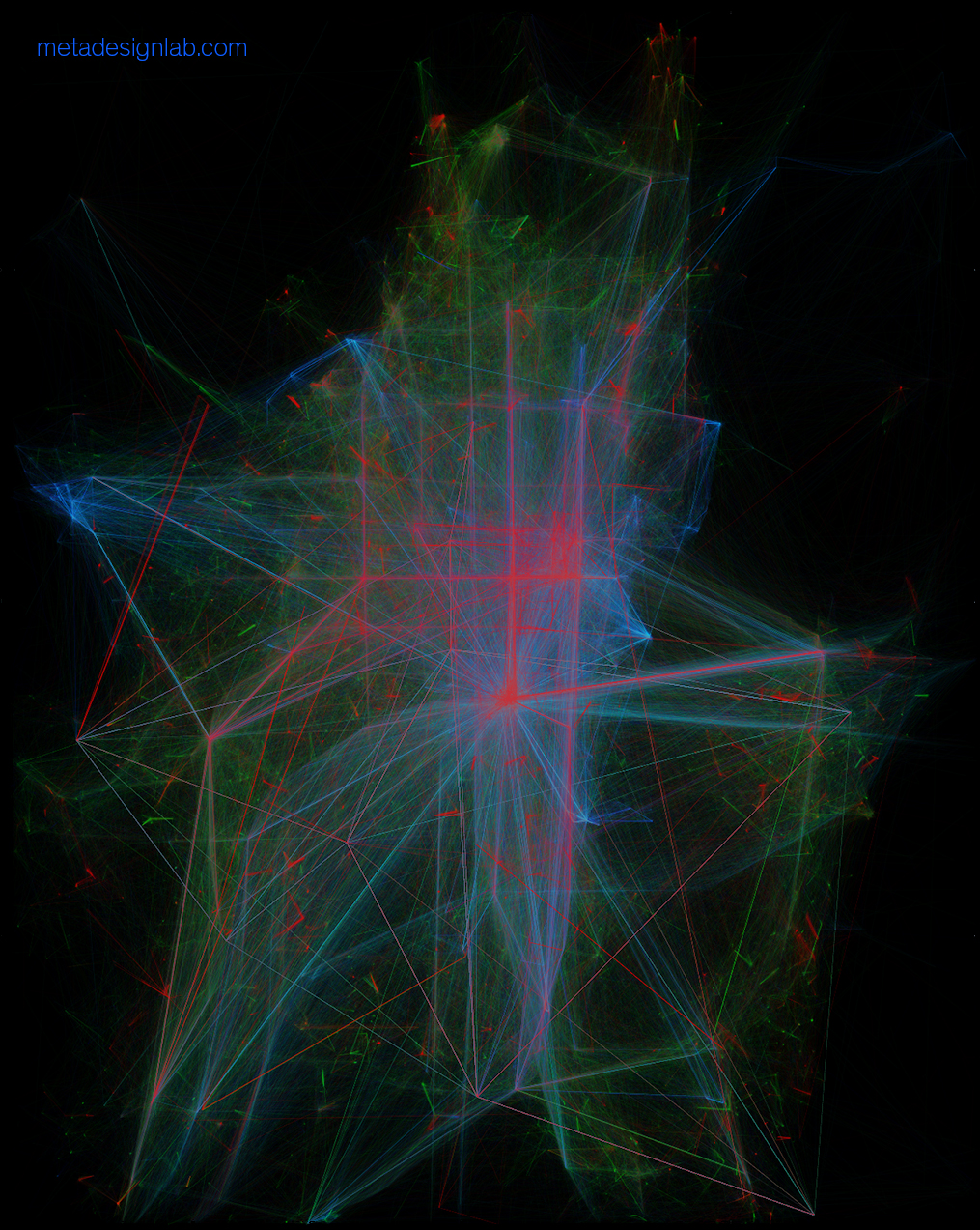
The above set of plots shows the direct 'jump' between two consecutive tweet messages which were sent less than an hour apart. The users are filtered into groups of users relating to the number of Tweets over the whole 3 year period they sent. This is done so as to show the differences between people who have messaged very little and thus are likely to be visitors or tourists, and more local users. The data shown int he above plots ordered left to right top to bottom is outlined below:
- Users with 1 to 10 tweets: 138797 pairs representing 95438 unique users (cyan)
- Users with 10 to 100 tweets: 599893 pairs representing 38795 unique users (blue)
- Users with 100 to 1000 tweets: 348400 pairs representing 8492 unique users (green)
- Users with 1000 to 10000 tweets: 866966 pairs representing 626 unique users (red)
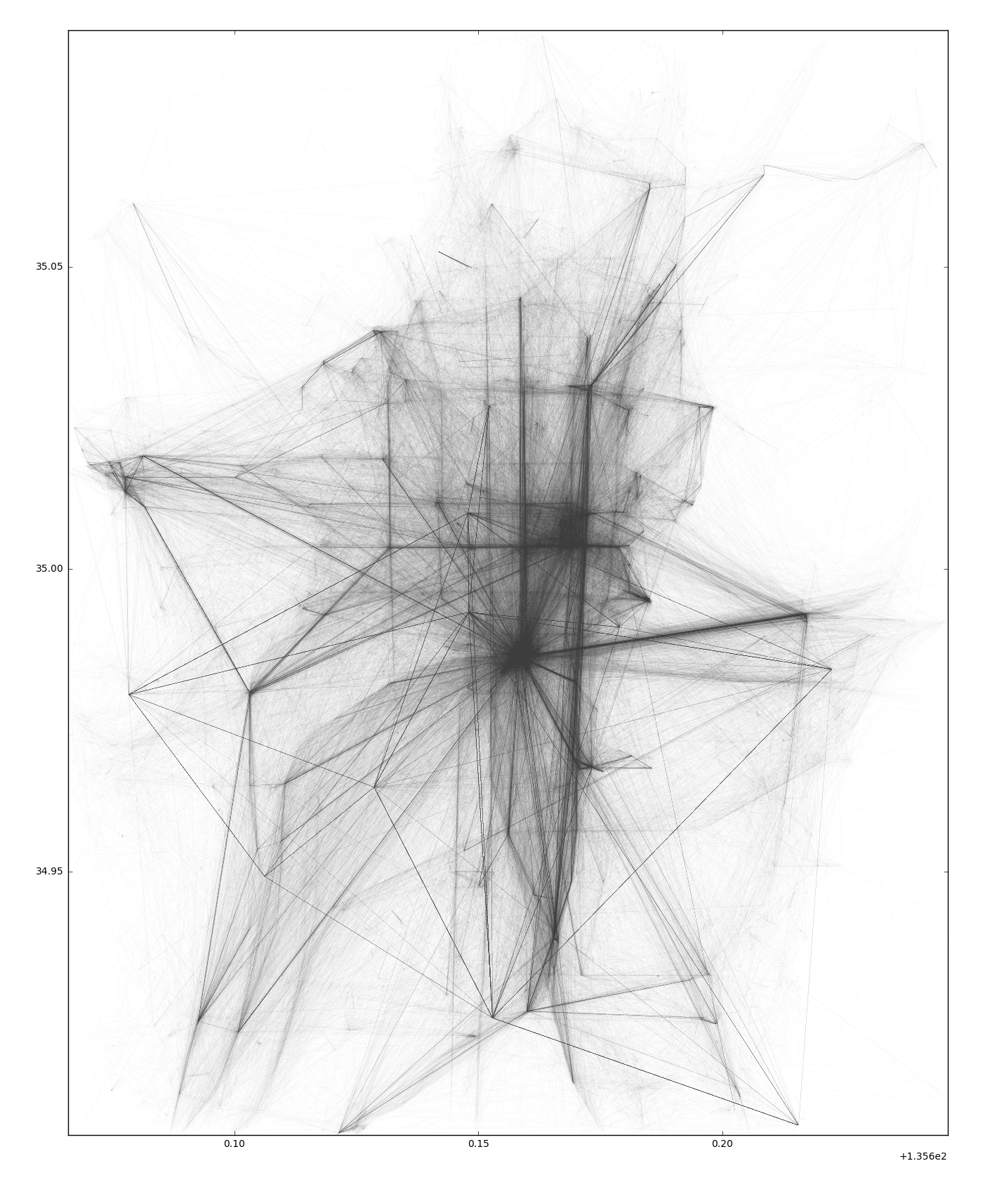
If the data is overlaid then these comparisons are also more obvious to compare. The below image shows this with each group coloured as indicated above.
This represents some findings from the initial study, more in-depth analysis is being undertaken.
This aims to uncover methods for identify the actives undertaken by different users and how they relate to how different groups of people use public space and engage in the city.
This will also use message content analysis used in the study of Singapore shown here .
If you are interested in this work please get in touch with the lab.