Social Space
Using Social Relationships to Determine Spatial Arrangements
An investigation into placing individuals in to groups based on their social interactions
In order to determine how people could be grouped based on social interactions, a set of emails communicated between employees of an architectural firm were chosen. The data collected contains 3662 emails communicated between 1653 emails addresses over a period of time. Each email has the following data attached to it: Body text as an array of words and their counts Sender email, Receiver emails, Subject and CC. This data were converted into objects of a custom email class along with additional aggregated information such as number of words and number of people who received the email. At this stage through anonymization is possible both obfuscation of body text into key words or removed entirely and individuals can be converted into user-id values.
Length of Emails
This corpus does not have enough information to understand in detail the 'nature' and 'use' of each email communication, we set up a simple keyword filter to remove some of the noise in the emails.
The keywords were identified by first getting rid of all junk words using the 'Tokenision' library from the NLTK (Natural Language Toolkit).
Then a set of custom words were created to remove some common words specific to emails in general ( eg: http,mailto,subject) and to the particular office (eg: names of individuals, address, salutations).
In addition to this all combinations of the employee names were removed as much as possible.
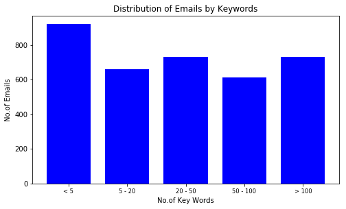
Then we could visualise how the number of keyboards relate to total number of words in an email.
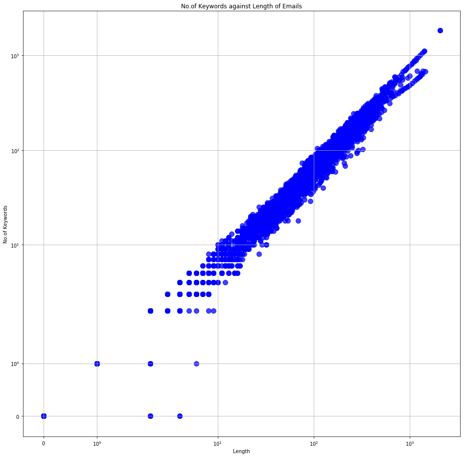
Total Number of Words vs Number of Keywords in all emails
And if we look at the email distribution based on total wordcount versus that of keyword count, we can see that although the number of longer (more than 20 words) emails is significantly higher, the number of emails with more keywords is not that significant.
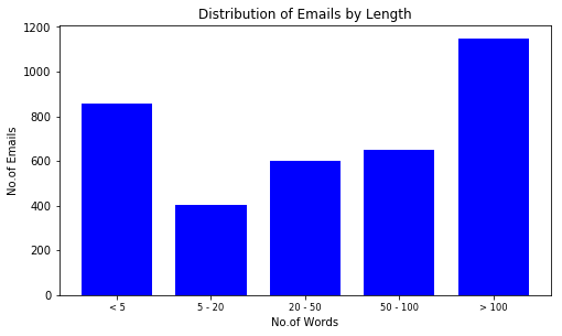
Distribution of emails by word count
Recipients of Emails
We could also visualise the lengths of the emails against how many people received them. A lengthy email reaching a lot of people is more likely to be an office wide announcement while a shorter email among a few people could be a project discussion.
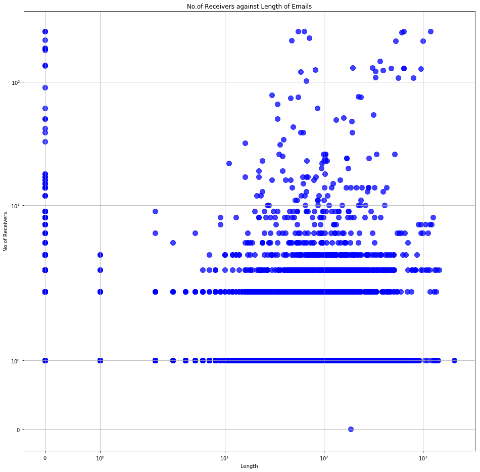
Number of Receivers vs Length of emails
We could explore this same concept further by visualising the percentages of email communication among individuals, small groups (less than 5 people) or larger groups of more than 5 people. Based on this data, we could easily see that majority of communication has happened between individuals and small groups while less than 10% of the emails include more than 5 people. Which does suggest that email communications in this context could indicate a strong social (work based) relationship.
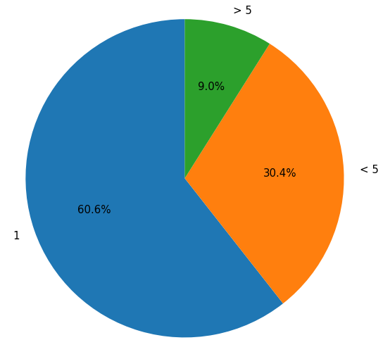
Percentage of emails by No. of Recipients shown on the outside
Distribution of People
If we do a similar aggregation on people based on number of emails sent and received, we may understand the role of each person within the organisation.
Generally people within a group would send an receive an equal number of emails due to the forth and back communication.
A higher number of sent and received emails is indicative of a key person who is a leader of a group, or perhaps involved in several projects.
Alternatively, a few people would send more emails than they receive, indicating a coordinator or PA kind of role, or receive more than they send, indicating someone one who might not be engaged too much in group communications.
Number of emails sent and Received by Each
By banding the people based on number of emails sent or received, we could identify the general trend within the organisation. In this case, for the period given, most people sent less than five emails. While the amount of people who received up to five emails is more than four times of that. This indicates that generally people receive more than they send.
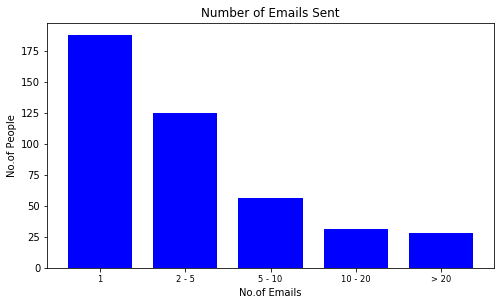
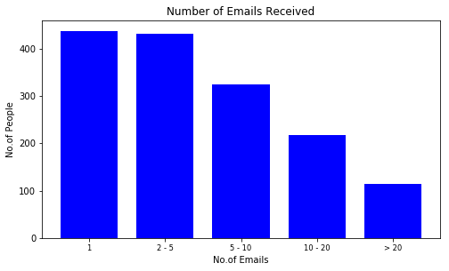
Distribution of People by emails Sent (left) Distribution of People by emails Received (right)
Grouping based on Emails
In order to group people into clusters, we need to break down all the emails into single threads between two people. Once that is done, we could aggregate the total communication between each pair to create a normalised score, where higher score indicates stronger social relatinship.
With this data, it is possible to run a clustering algorithm to create groups of related people.
This can then be visualised using a network graph as below.
The circles indicate a person coloured according to their group.
Each line indicates a direct communication relationship between two people, while their lengths indicate the strengths.
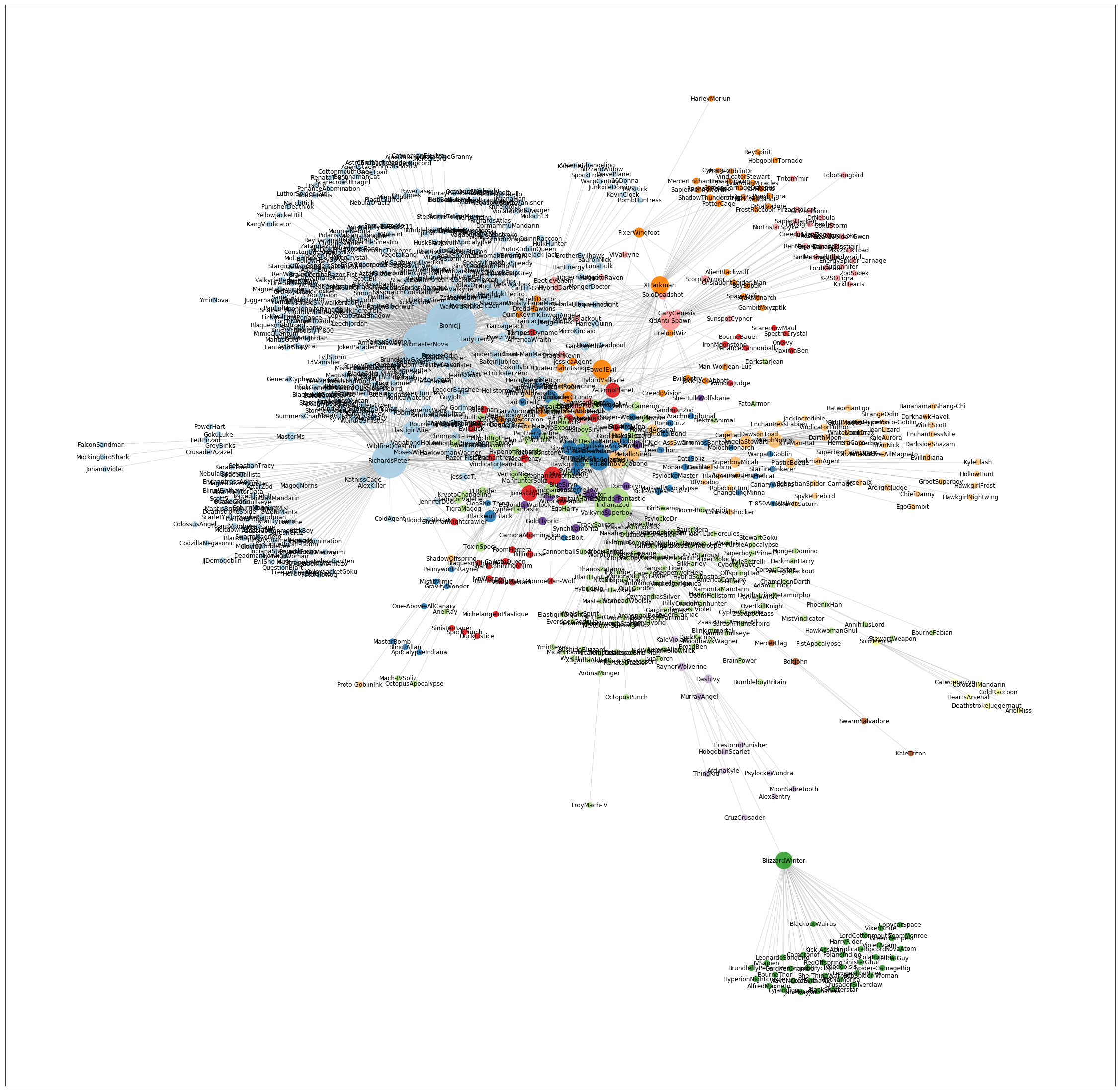
Network view of clustering based on everyone (sent or received atleast 2 emails)
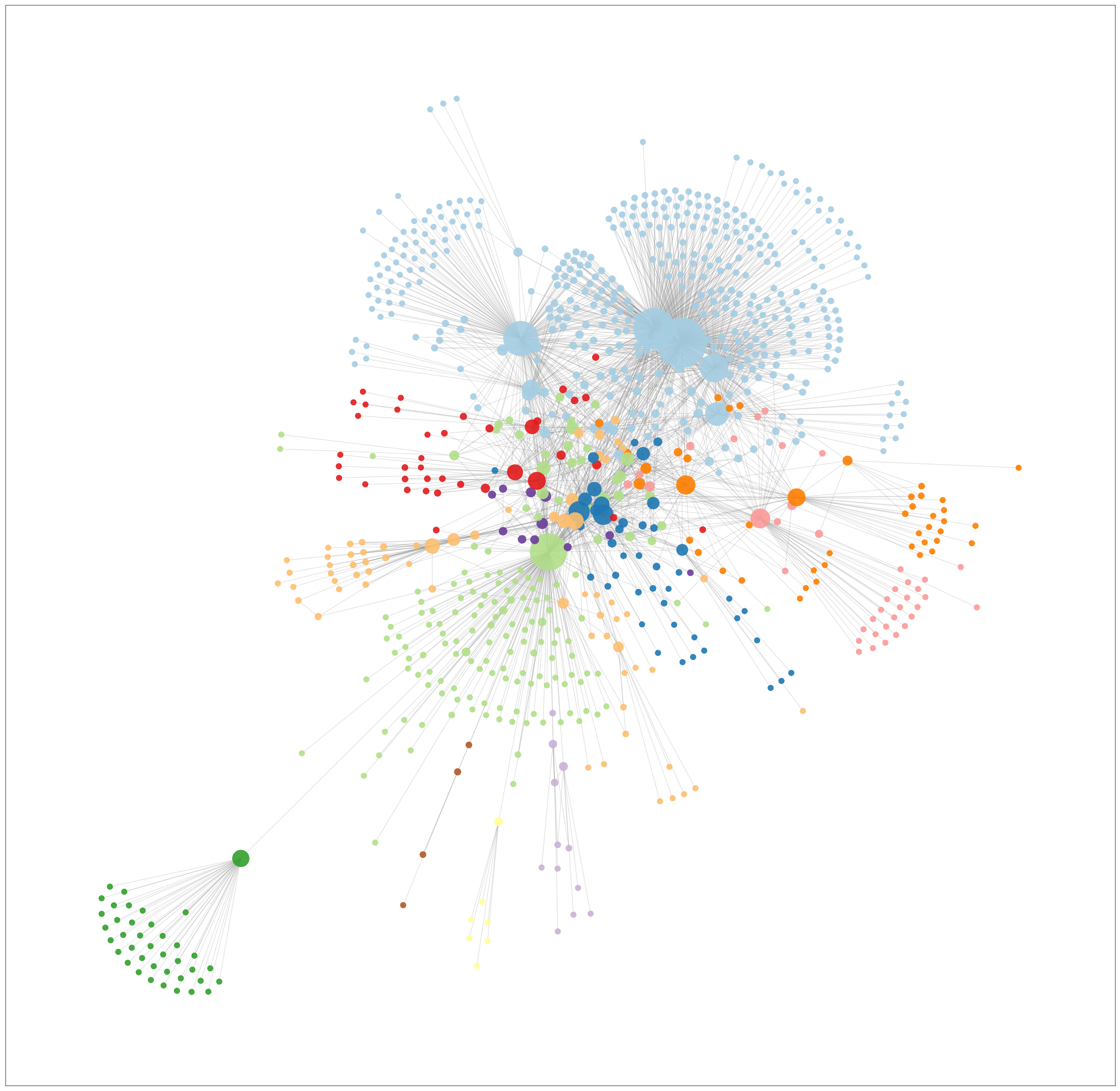
Once we have the network, we could identify the key people based on their 'connectivity degrees', or number of links to unique individuals. Here we have isolated people who are in contact with more than one person (have a degree of more than 1) and re-clustered them into new groups.
Network view of clustering based on people who are in communication with more than 1 person ( degree >1) from the above group
Visualising Interactions
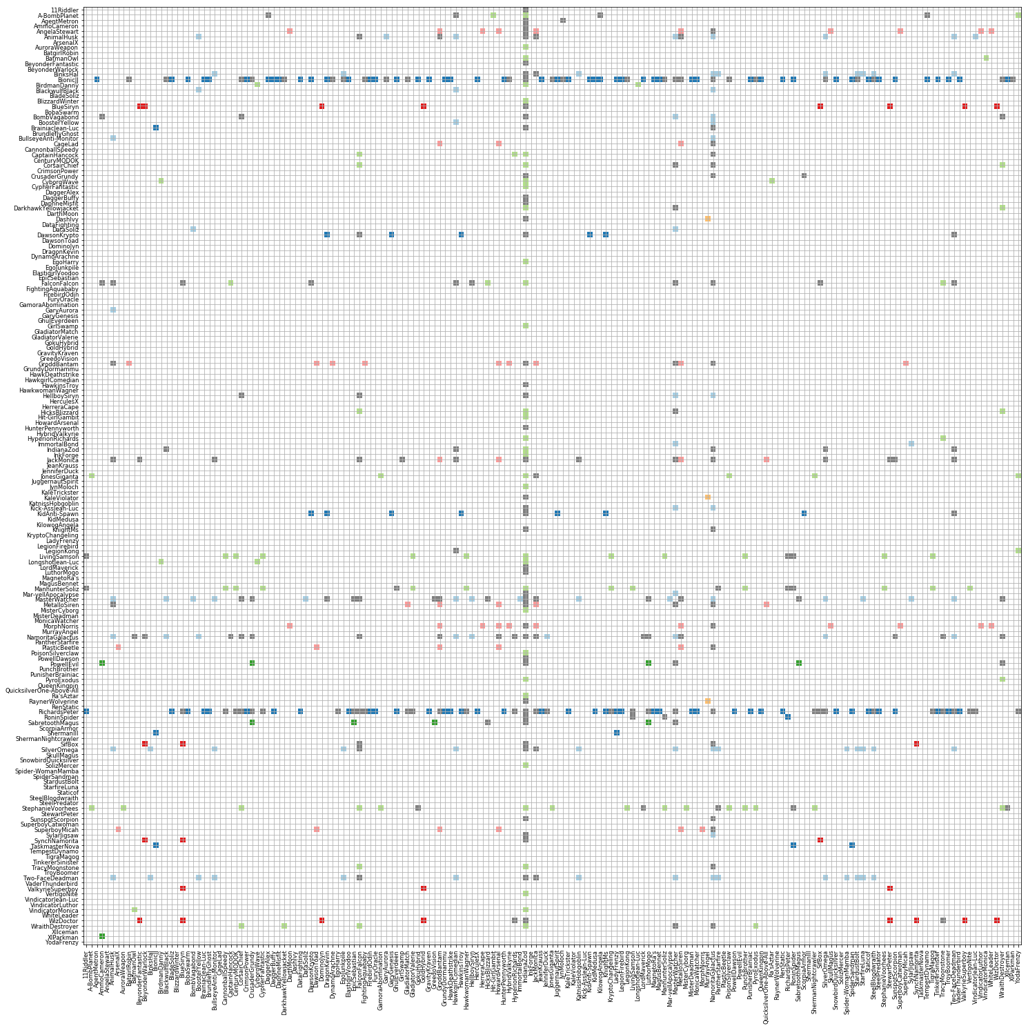
Since each email is directional (from a specific person to a specific person), the individual relationships could be better understood by visualising as a matrix graph with people on both axes. The y-axis representing the senders and x-axis, recipients. Below is a matrix graph for people before filtering (the colors follow the same groups). Each grid point represents an existing communication from the person on the y-axis to the person on the x-axis.
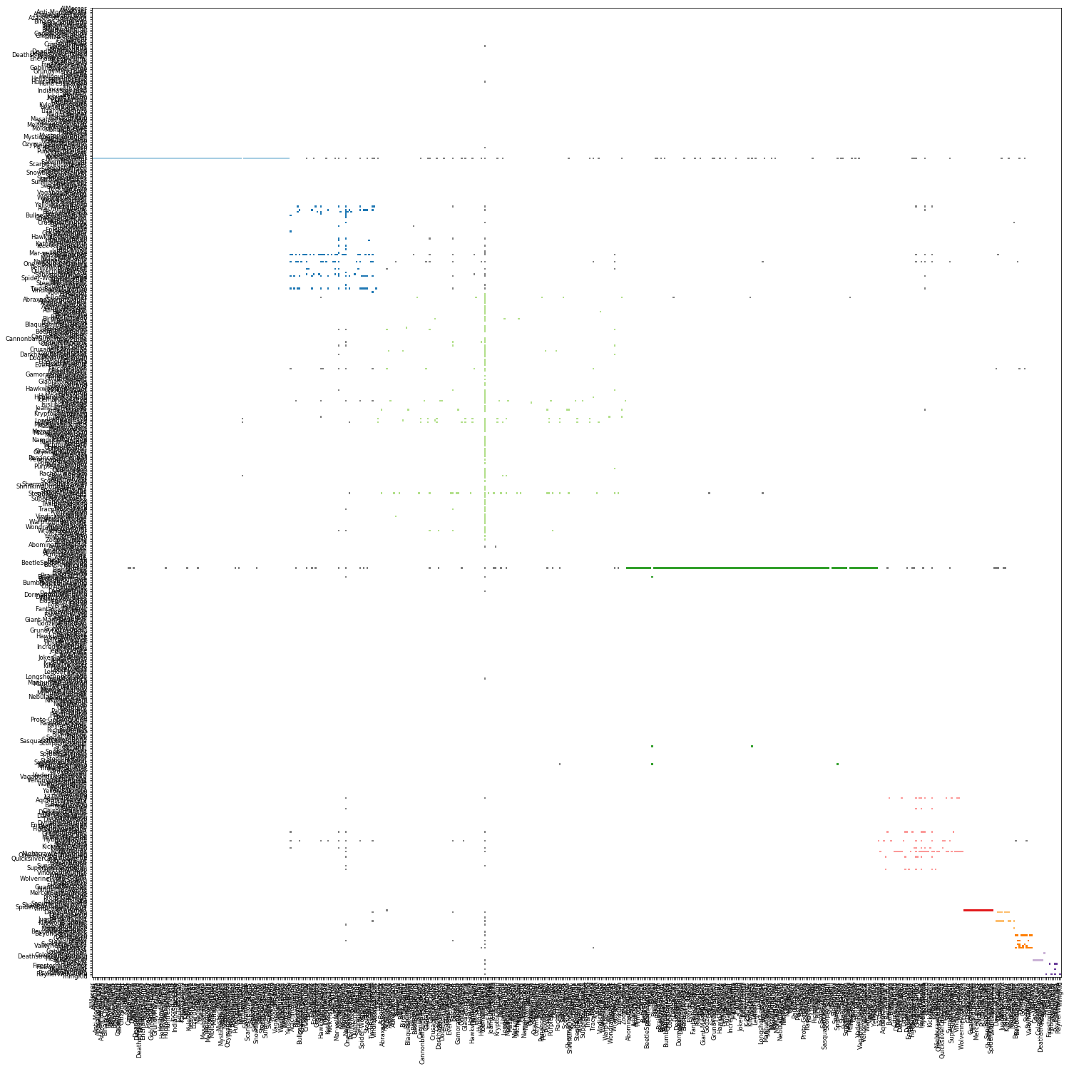
Matrix view of all sorted by group and by Name
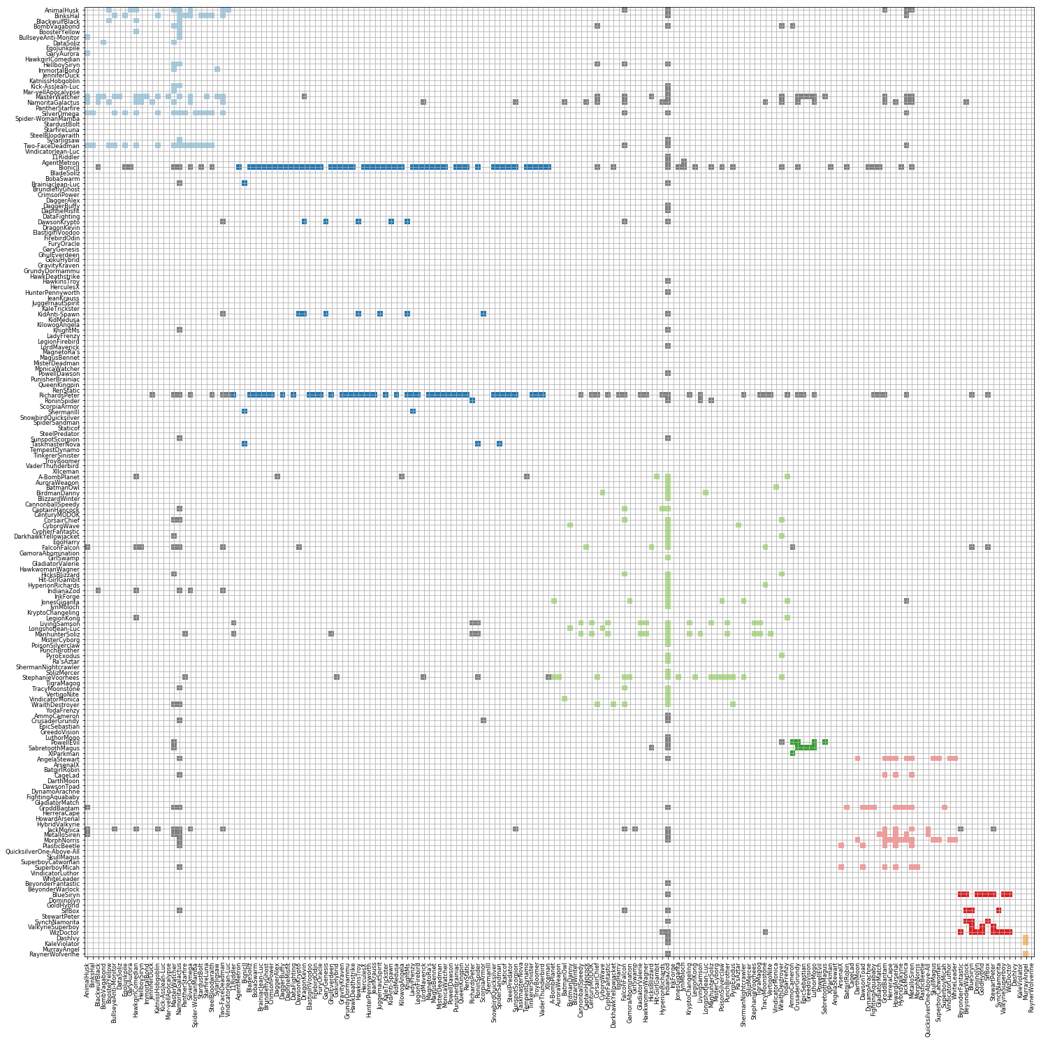
We could get a better view by plottong the filtered clusters as below. The colored threads indicate communication within group, while the grey ones show communication between people across groups.
Matrix view of selected sorted by name
If we sort the graph by groups, we could understand the relationship within and across groups more easily. Those groups with a lot of internal communication tend to have a more symmetric shape while those those groups where a few key people send out most of the emails tend to be more asymmtric.
Some groups tend to have a high internal communication with minimum external communication, while some groups communicate well within and across several groups.
Matrix view of selected sorted by group and by name
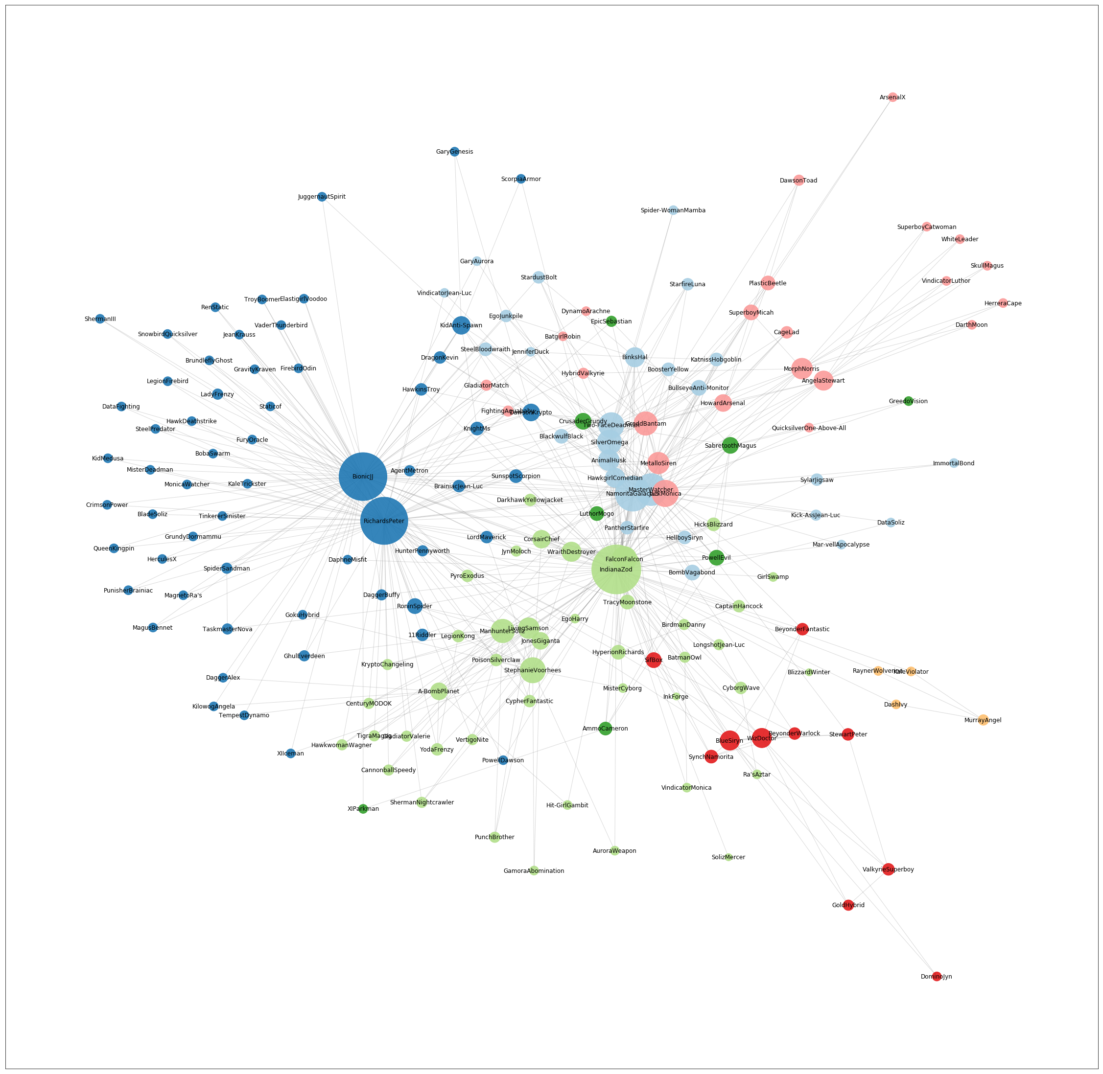
By sorting the graph based on connectivity degrees, we may identify the people who communicate with most people along with who those people are in terms of grouping and their connectivity.
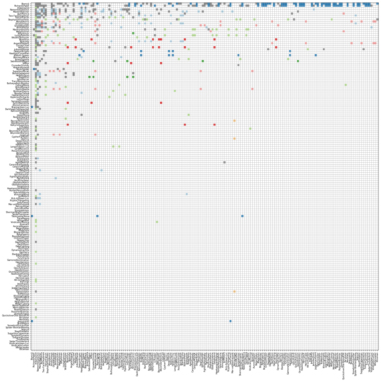
Matrix view of selected sorted by degree
It is also possible to do a similar sorting within each group to analyse who communicates most within their groups and who communicates most across.

Matrix view of selected sorted by group and by degree
Visualising Key People based on Connectivity
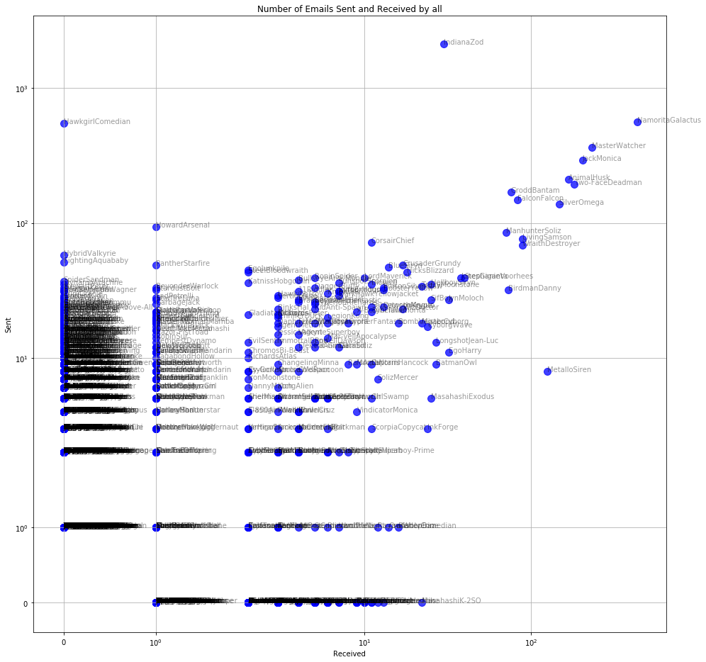
Another way to identify key people is to plot the number of emails sent or received by a person against the number of people they are in touch with. Generally, the more people a person communicates with, the more emails they will send or receive.
But as can be seen below, some people communicate a lot with just a handful of people, while a few are in communication with a lot of people, but do not communicate as much.
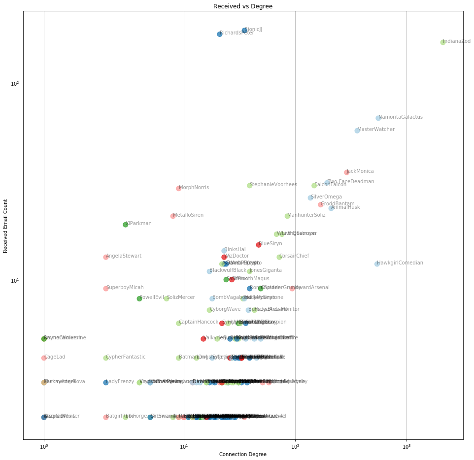
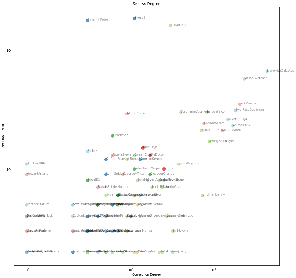
Scatter view of number of emails a)received b)sent, against connectivity degree for each person
If we plot a similar graph using the total number of emails (sent and received), then the trend of more communication equals more connectivity is stronger.
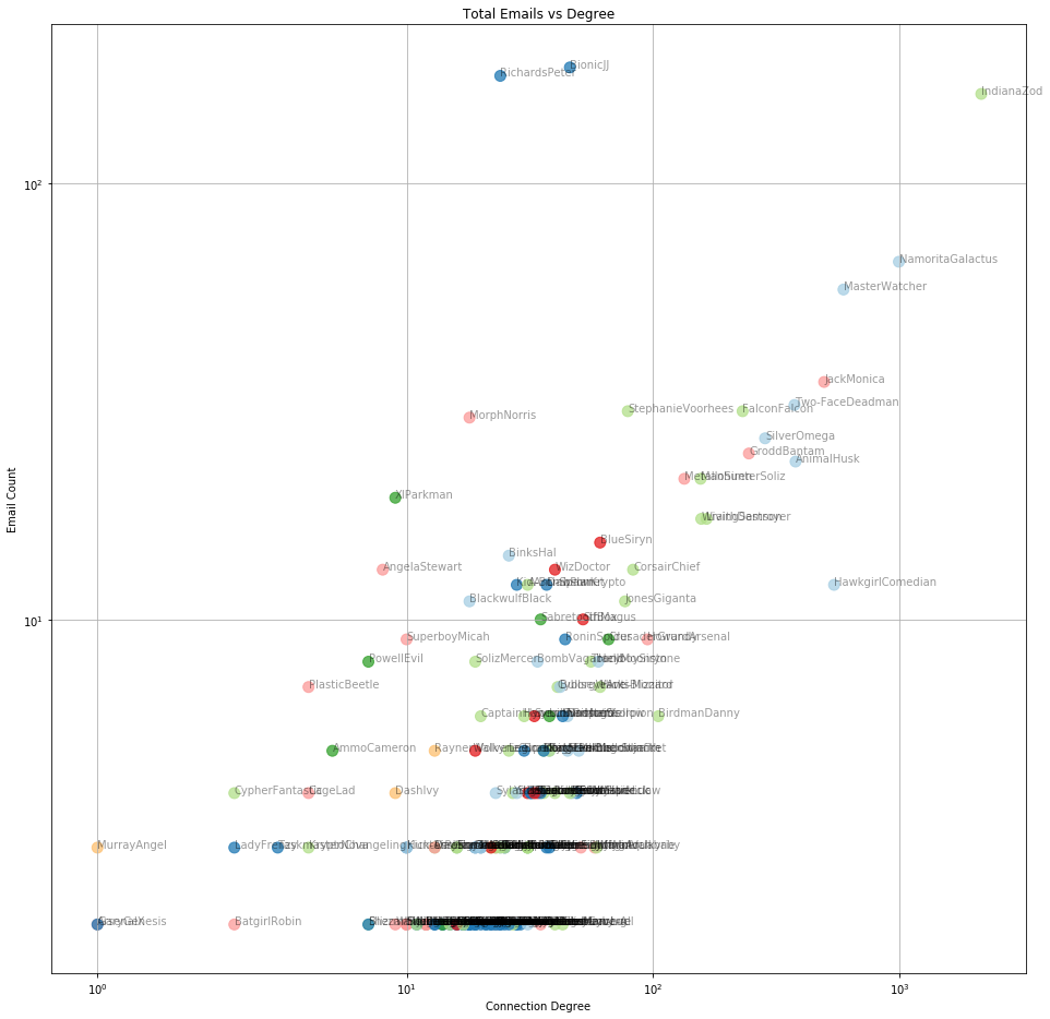
Scatter view of email count against degree for each person