Social Space
Using Social Relationships to Determine Spatial Arrangements
An investigation into clustering seats based on their spatial relationships
In this study, we use an existing floor plan to identify and calculate several spatial relationships that could affect the potential communication and social interactions within an office environment.
Once these relationships have been established, we could use them to calculate how strong the connections are between different seating positions and in turn generate clusters of strongly connected seats.
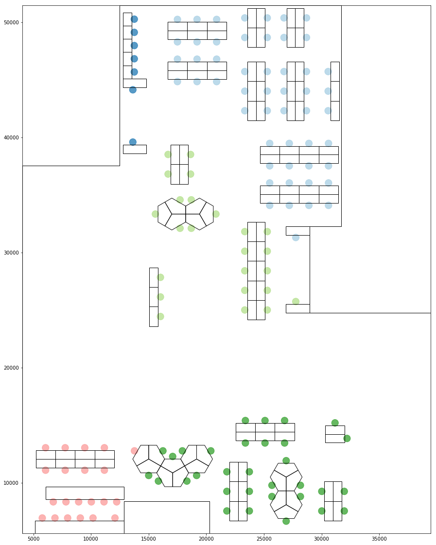
Base Layout
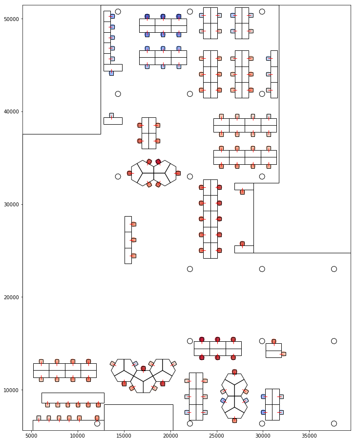
A simplified layout representing only the key elemens such as tables, seats and columns were extracted. A simple vector line was added for each seat to represent their orientation. We could then extract the positions and orientation for each seat for analysis.
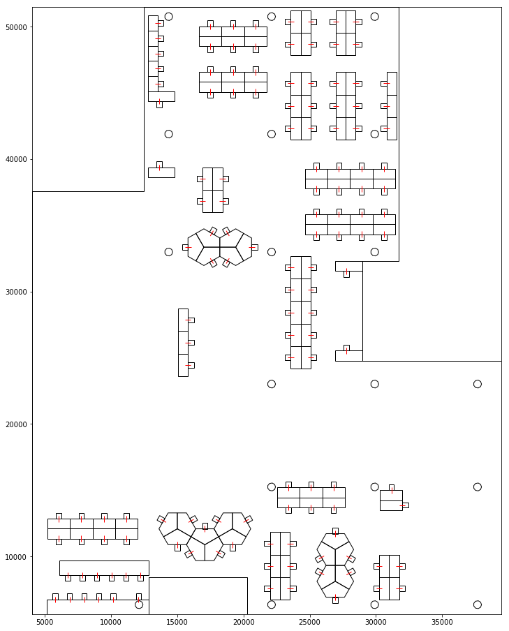
Seating Layout used for Analysis
Visual Proxemics
One key spatial relationship that could affect communication is visual connection.
Who you can see and who can see you plays an important role in establishing a social connection. Here we use view weighted proxemics.
Hall, Edward T. (1966). The Hidden Dimension
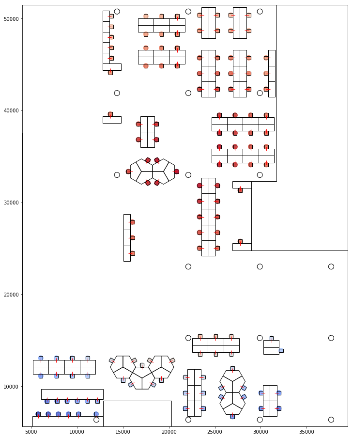
Proxemics defines the interpersonal distances around a person based on social distances.Eg: less than 0.45m is intimate while 3.7-7.6m is public. Visual proxemics uses the same idea but gives more weight to the space infront (in view) and less weight to the space behind (out of view) a person. This captures the visual distance while taking in to account the direction of view. Below is a aggregated visualisation of the proxemic boundaries of each seat.
Layout showing proxemics of individual seats
For each seat, a proxemic score from and to every other seat was calculated. The scoring is based on a set of discrete proxemic thresholds. These were then aggregated for each seat to represent how much a seat is visible from all the seats and how much the seat is visible to others.
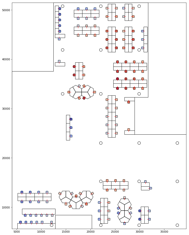
Visualising Proxemic Scores 1 - How much is visible from the seat 2 - How much the seat is visible
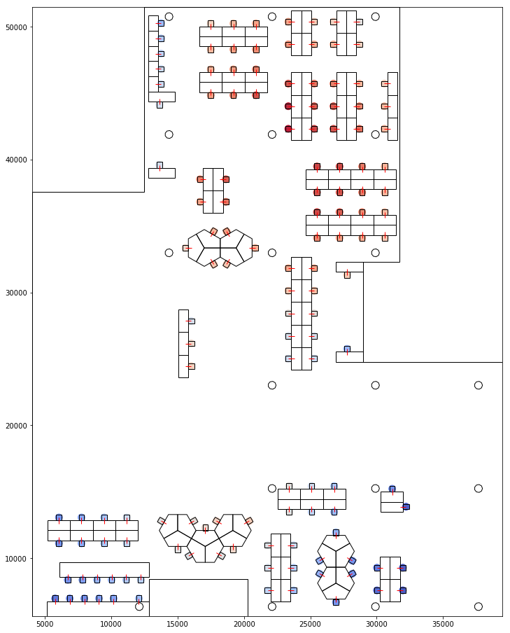
The same was done based on proxemic distances. The graphs below represent how far a seat is visible from and to all other seats based on proxemics.
Visualising Proxemic Distance< 1- From 2- To
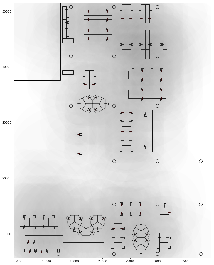
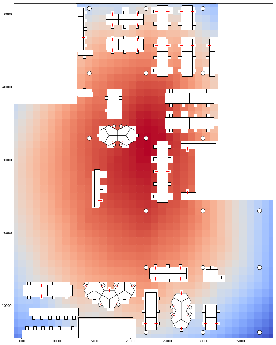
Using a similar approach, we could calculate proxemic distance and scores of a point on the floor plan to the seats. This would determine how much the point could be seen by a person. And by doing this for a grid of points on the floor, to all seats, we could determine which areas on the floor plan is most visible and which areas are most hidden. Which areas give most privacy and which areas are most public.
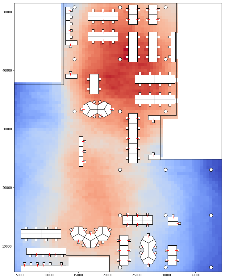
Visualising Proxemic Scores and Proxemic Distance of the floor grid. Blue less visible. 1 - pScore 2 - Dist
Circulation and Accessibility
Another useful spatial metric is the walking distance. How easily someone can walk to and from a person determines how accessible that person is. This could be examined by analysing the circulation paths taken by all.
Since we do not have that data, a simple circulation grid with multiple pathways was created and each seat was connected to the closest node in the network.

Visualising Circulation grid
And a path finding algorithm was used to determine the shortest route from each seat to every other seat. Below is a composite view of all the prefered paths for each pair. The darker paths are those used most.
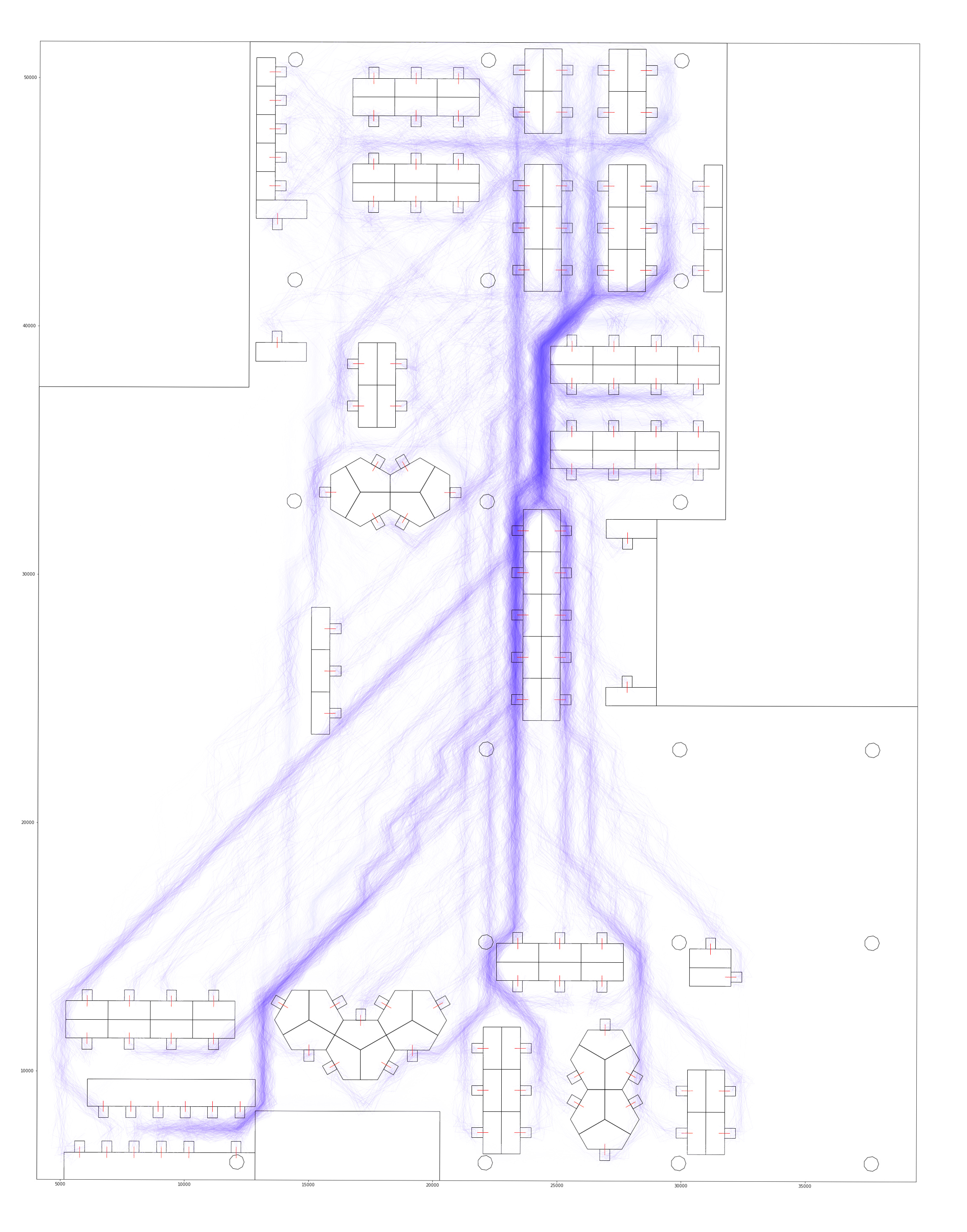
Visualising Circulation Paths
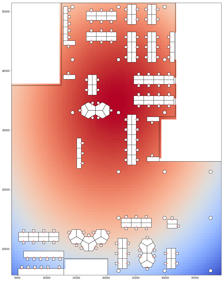
Once the prefered paths have been identified, we could aggregate the number of times each node is travelled through. Hence identifying the busiest nodes.
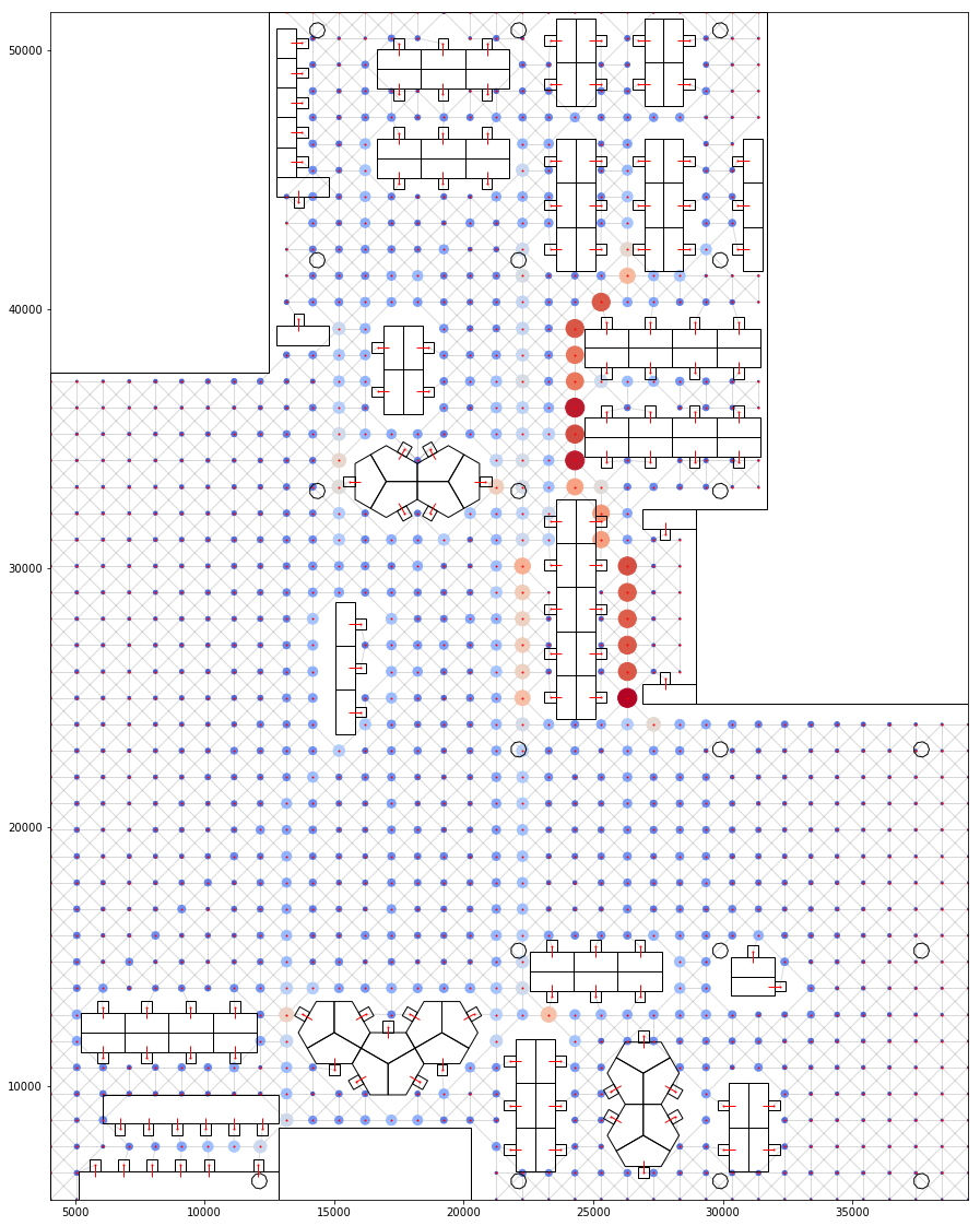
Visualising Hot Spots based on number of people walking through
This could also be translated into the floor grid to visualise "hot spots" on the floor.
Visualising circulation grid
Based on proxemity to the hot spots, we could then give a scoring to all the seats to determine how "buzzy" they might be. This is an indication of likely others are to run into them. Which could foster more communication or could easily be a distraction.
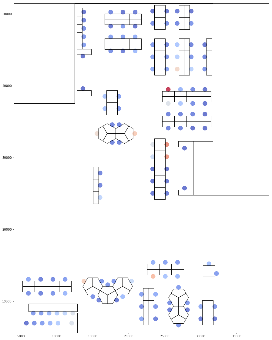
Visualising Hot Seats based on proximity to hot nodes
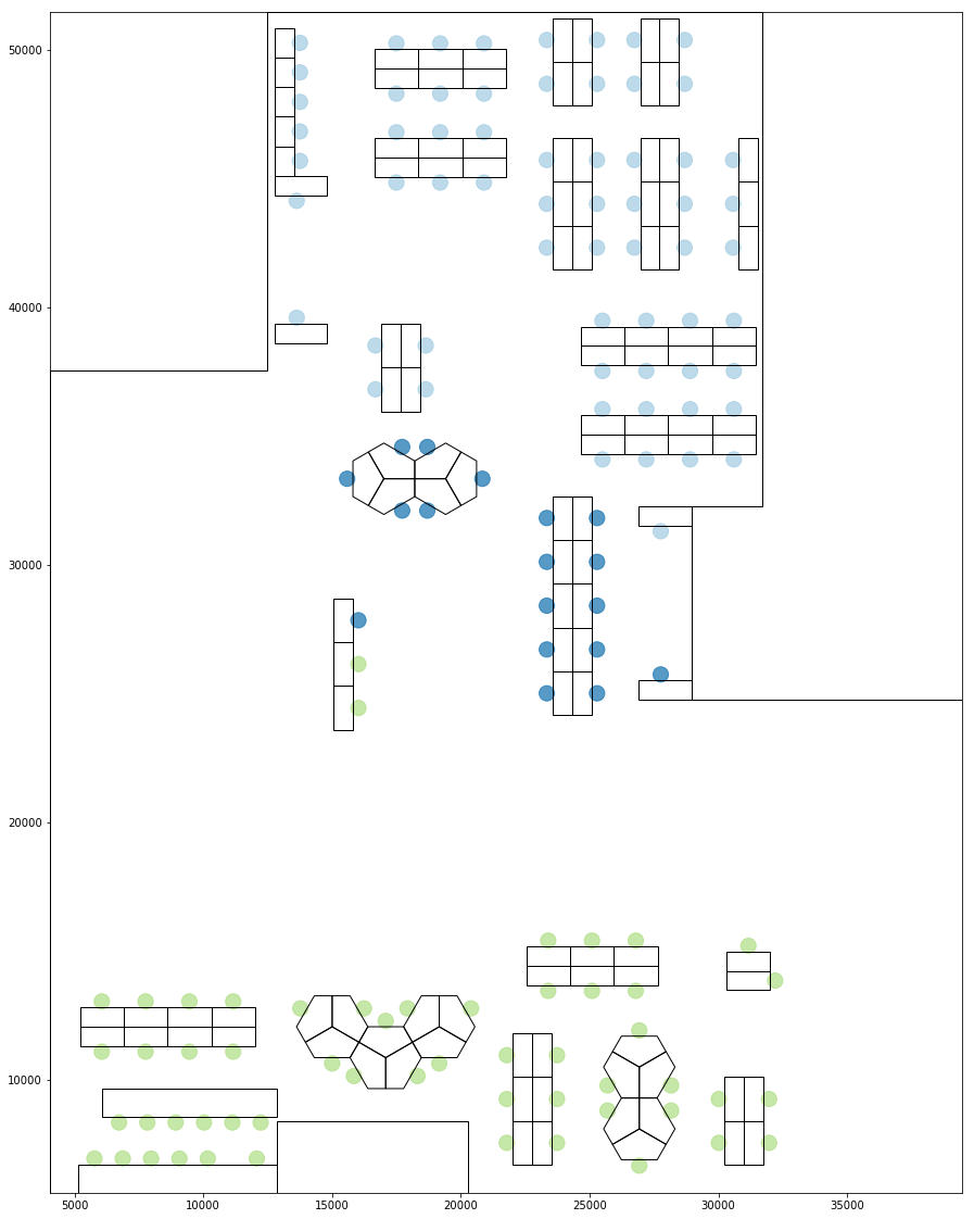
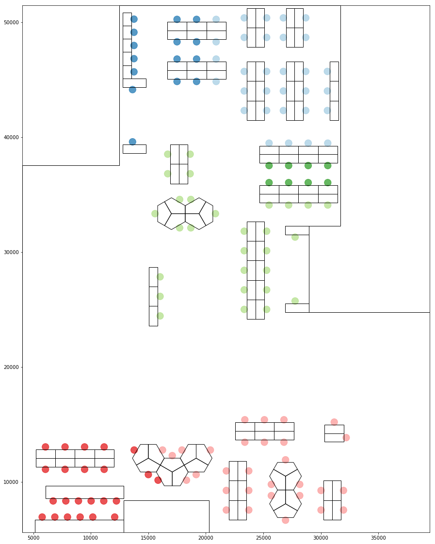
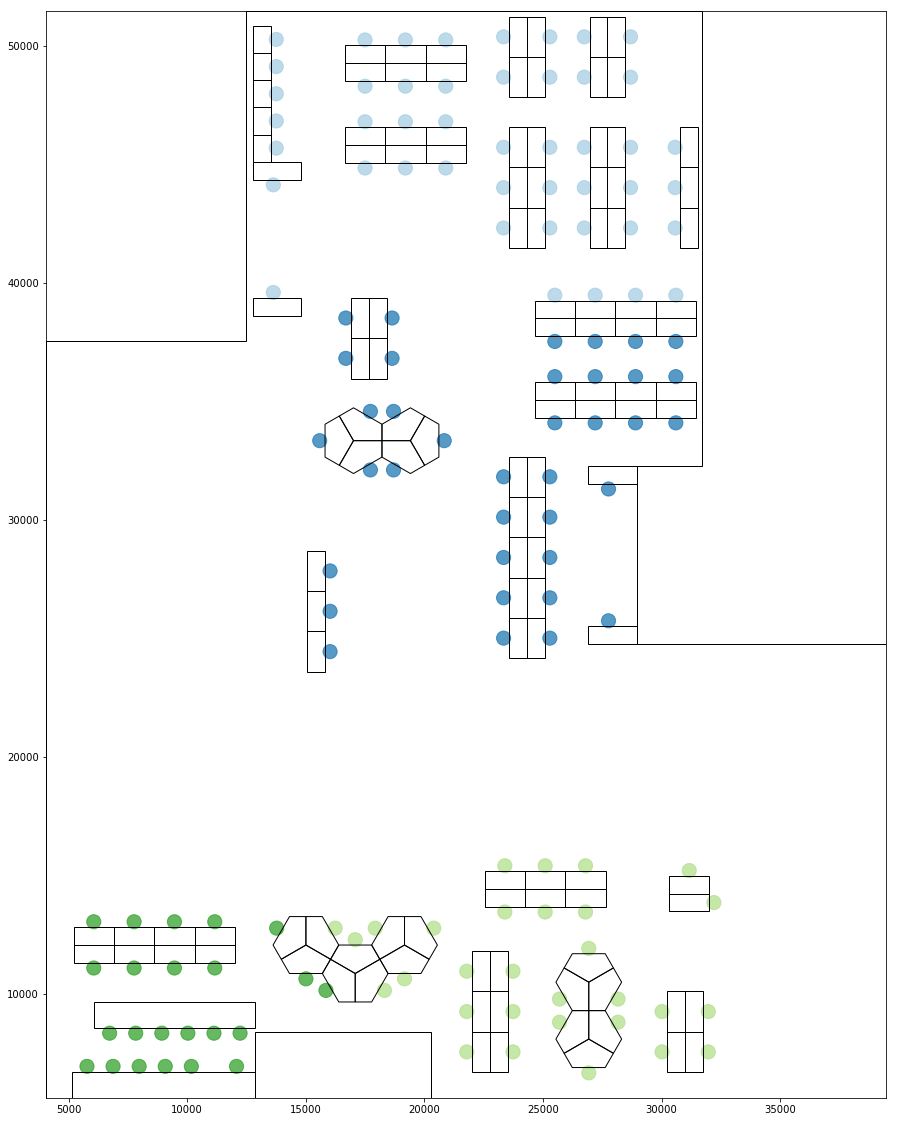
Grouping based on Spatial Relationships
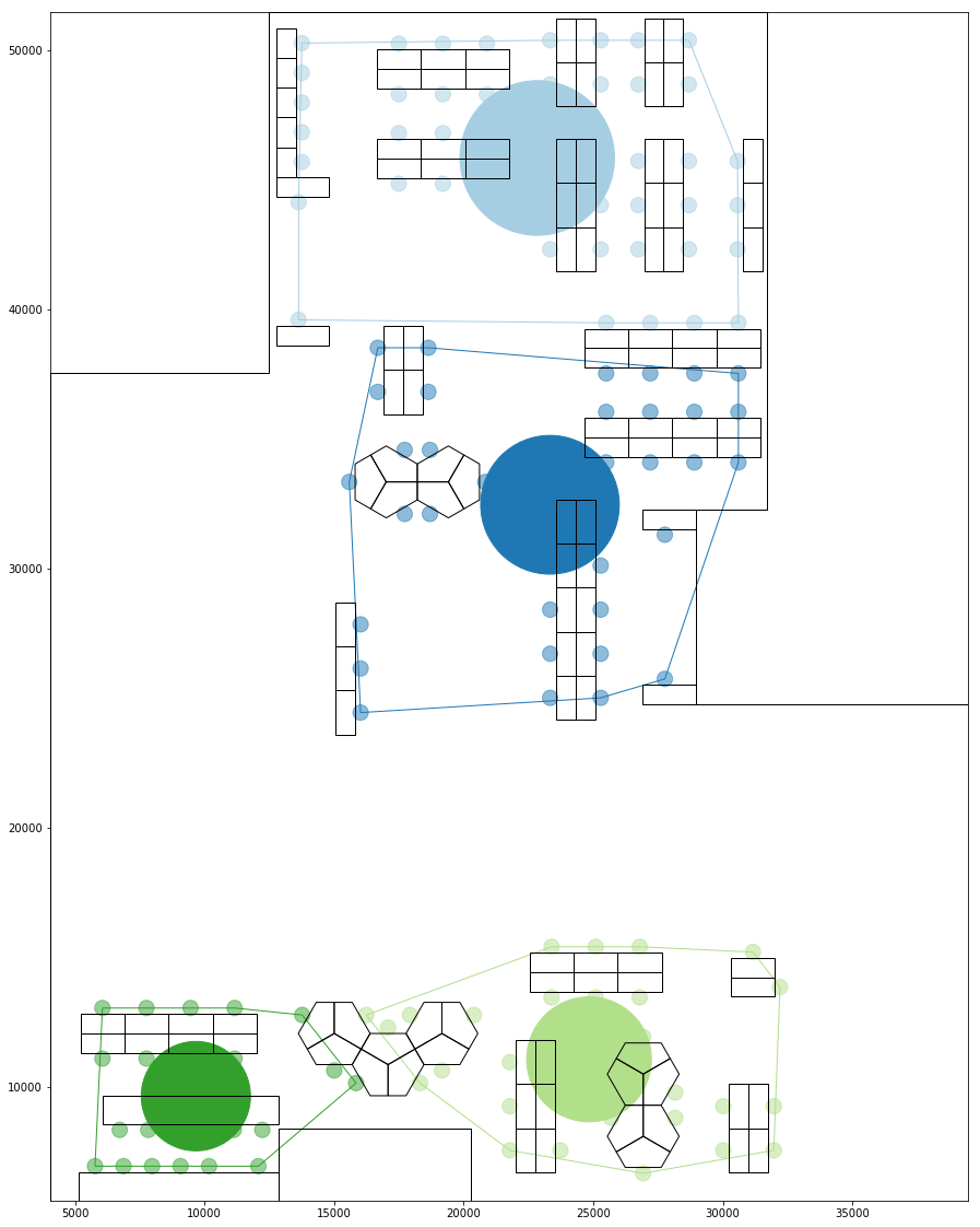
Using these spatial metrics as links between different seats, we could run a clustering algorithm to create groups of spatially related seats.
The graph below shows grouping based on proxemic distances between seats. The distances are normalised as an iverted ratio with the pair with lowest proxemic distance, and therefor closest in view, having a score of 1. Seats facing each other tend to have a stronger visual proxemic relationship.
Grouping Based on proxemic distance
If we do a similar grouping based on the proxemic scores, i.e. seats scored based on discrete bands of proxemic distances, the groupings are less defined and weaker.
Grouping Based on proxemic score
Grouping based on walking distances show a different type of relationship where a person who is close in terms of visibility could be further in terms of how accessbible they are. For example people sitting opposite to each other.
Grouping Based on walking distance
Grouping based on Combined Metric
Since the different metrics focus on a different aspect of spatial relationships, they group the seats in different ways.
We could combine these to obtain a super metric which represents the overall spatial relationship strength.
The groupings below has been obtained using a combined metrics where a stronger weight has been assigned to those who has a high proxemic distance score.
Combined Grouping, Combined Grouping Bounds and centroid
Understanding Social Relationships
Once the groups have been formed, we could determine how social each seat is by aggregating the number of spatial links it has. For each seat position, two scores is created.
One based on number of intra group communications and one based on across group communications.
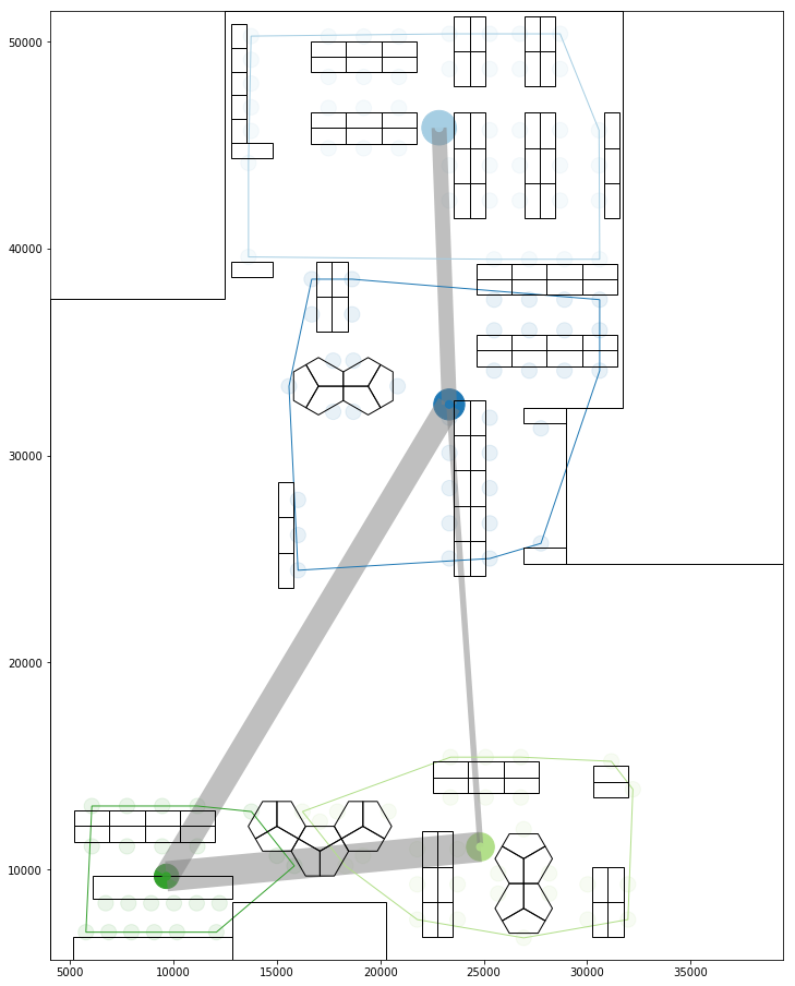
These could then be aggregated to create a similar score for each group, hence determining which groups are best situated to collaborate with others.
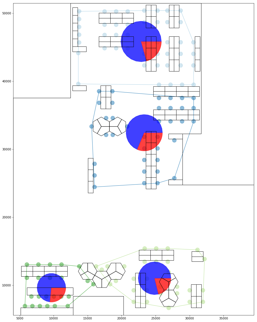
a) Collaboration Percentage blue:within group, red:with others
b) Collaboration network
These social relationships within and across groups could also be visualised using a matrix graph. The colored areas represent intra group spatial relationships, while the grey represents across groups.
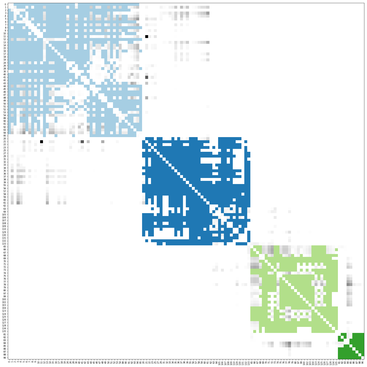
Mat all
We could split the above graph to show just the internal communication and external communications as below.


Mat groups